American Airlines Design Test
Design Brief:
Scenario
You and a friend are on a flight from Los Angeles to New York with a layover in Chicago. When you land at ORD airport, you learn that American has canceled your next flight due to a snowstorm in New York. That happens to be the last flight to JFK for the day and American has booked you on the first flight out in the morning. All passengers will be compensated with a free hotel room for the night, and meal voucher for dinner. You and your friend are on the same reservation and you will receive an email with the details and a link to the web page where you will select your options.
As the UX Product Designer, your job is to create the flow that takes the user from the email to where they choose a hotel, get meal vouchers and confirm their selections.
Business rules
- Recommend at least 3 hotels showing their photos and details
- Ability to choose room quantity for multi-passenger
- Provide a check-in code and confirmation number upon completion - Meal vouchers are valid only the day issued; use a QR code
- Voucher good for $12 food and beverages; excludes alcohol
- Ability to decline offer

The process
Step 1: secondary research. I started by looking at other examples of food vouchers and room booking processes and looked for common patterns.
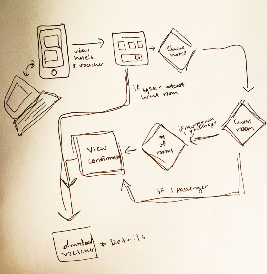
Step 2: user flow. I planned how the users would arrive at the site, book their hotel and use their vouchers.

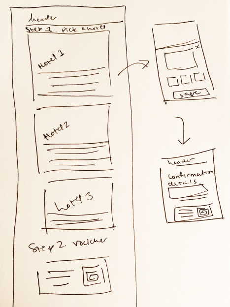
Step 3: wireframe. I created a basic layout for how I would make the page work. I started with mobile for this project and while it’s almost always a good idea to start with mobile, in this case it was particularly important since the users would most likely be accessing this page from a mobile device since they would be at an airport having their flight cancelled.
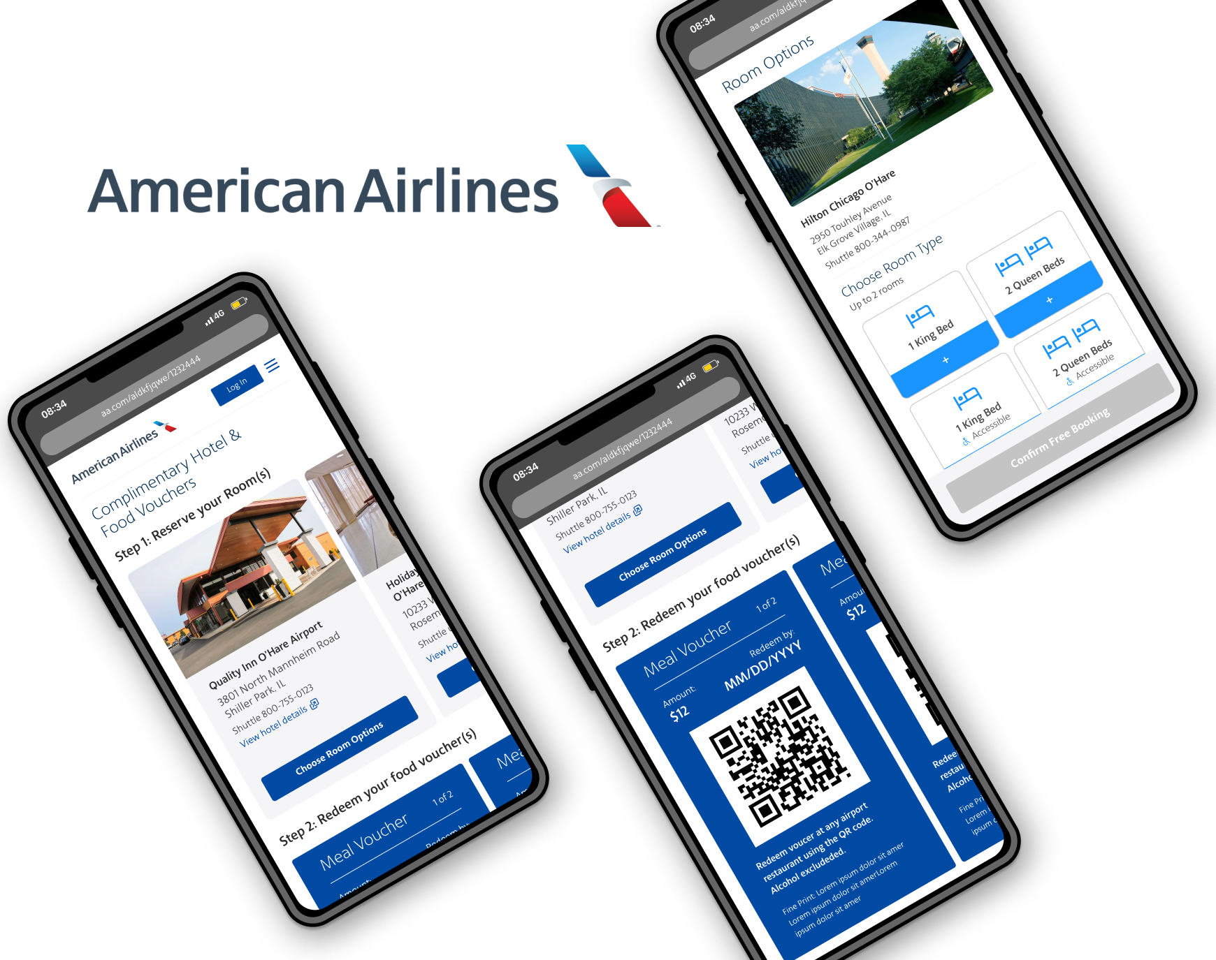
Step 4: high fidelity designs. I started laying out the mobile design in Figma based on my wireframe and user flow. I am a huge fan of Figma’s components (aka symbols), auto-layout, and prototyping abilities. I utilized all of these to create a comprehensive and consistent design.

Step 5: interactive prototypes. I’m a firm believer in prototyping because you get a much better feel for the design than a frame. Many times I have created a design that I was satisfied with, but as soon as I began looking at the prototype in Figma mirror on my phone I started to notice where the interactions weren’t intuitive.
Step 6: User testing. I began testing with a few volunteers. Of my volunteers, three of my testers were over the age of 50 and two did not speak English and all of them travel frequently. It was important to include users in the test who may be considered less “tech-savvy” since it would really show where there were flaws in the design. Upon testing I found that several of the users were struggling with a small “add button” and one was confused by how to select a room and how to multi-select. I used this valuable data to improve on the designs. I made the ‘add’ buttons much clearer and easier for touch.
Step 7. Breakpoints. Once I had fully fleshed out the mobile version of the design, I created versions for tablet and small and large monitors.
